Design Eye Training : 106

Design Eye Training : 106 - roomfortuesday.com
design : lilse mckenna

Who is ready to kick off the week with a new Design Eye Training post? I’ve really enjoyed this series! Today, we’ll be analyzing and admiring a gorgeous bath in a historic Maryland waterfront home, designed by the talented Lilse McKenna (follow her on Instagram here). The original section of the home was built in 1750! The bathroom we’ll be scrolling through was designed to feel like an 18th-century conversion. It boasts antique heart-pine floors and period-appropriate fixtures (with modern conveniences, of course). This one felt especially inspiring to me because I noticed many uncommon design elements. Click through to take a little tour and chat all things interior design with me… this one is especially fun, thanks to the historic and higher-end finishes.

To quickly recap… in our Design Eye series, we observe and admire design fundamentals like scale, texture, pattern, material use, lighting plans, color, floor plan & layout, and a variety of intentional styling & interior moments pulled together by the pros. It’s an exercise I used to practice often in design school, and one I still enjoy today. By discussing and breaking down well designed spaces in greater detail, you’ll begin to train your “design eye”, build upon the design fundamentals, and can apply some of these things to your own home, if they appeal to you. I also feel like this series can really help you hone in your personal aesthetic, determining what you like and dislike… and most importantly, why.

Design Eye Training : 106 - roomfortuesday.com
design : lilse mckenna

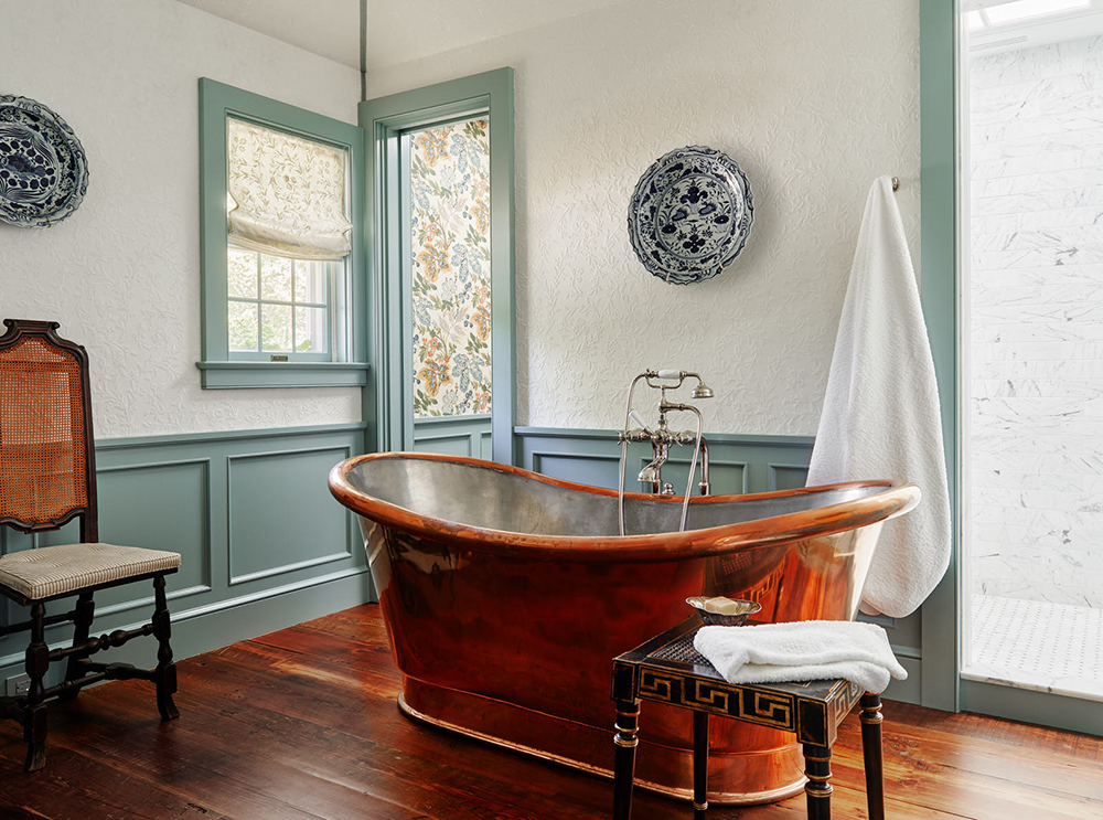
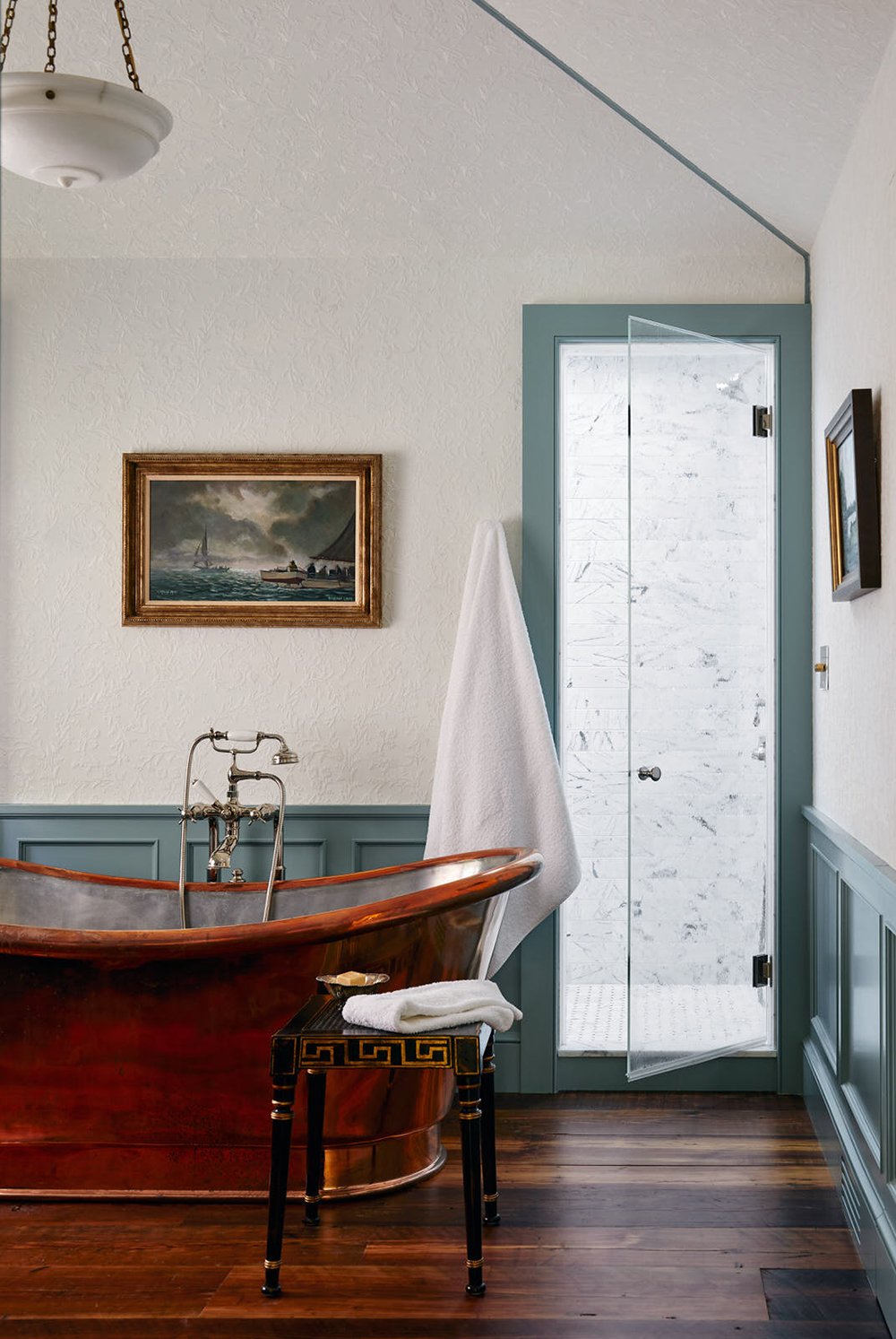
This stunning bathroom has a lovely color palette… it was the first thing to jump out at me (you know I love contrast trim). The cool aqua color is a really nice complement to the warm heart-pine wood flooring and copper fixtures. In addition to its beautiful shape, the soaking tub has a really nice patina going. That greek key table is also calling to me, beneath the plush white towels! I love the way Lilse mixed lots of metals and finishes throughout this space. I spy copper, polished nickel, antique brass, and even gold leaf. Normally, that would seem like a lot of warm metals to me, but they’re all working very well together. The millwork is simplistic with shaker style casings alongside the contrasting wainscoting that really anchors the room. I also caught a glimpse of a clean marble shower with timeless subway tile on the walls and a classic marble mosaic for the floor tile… see it in the background?

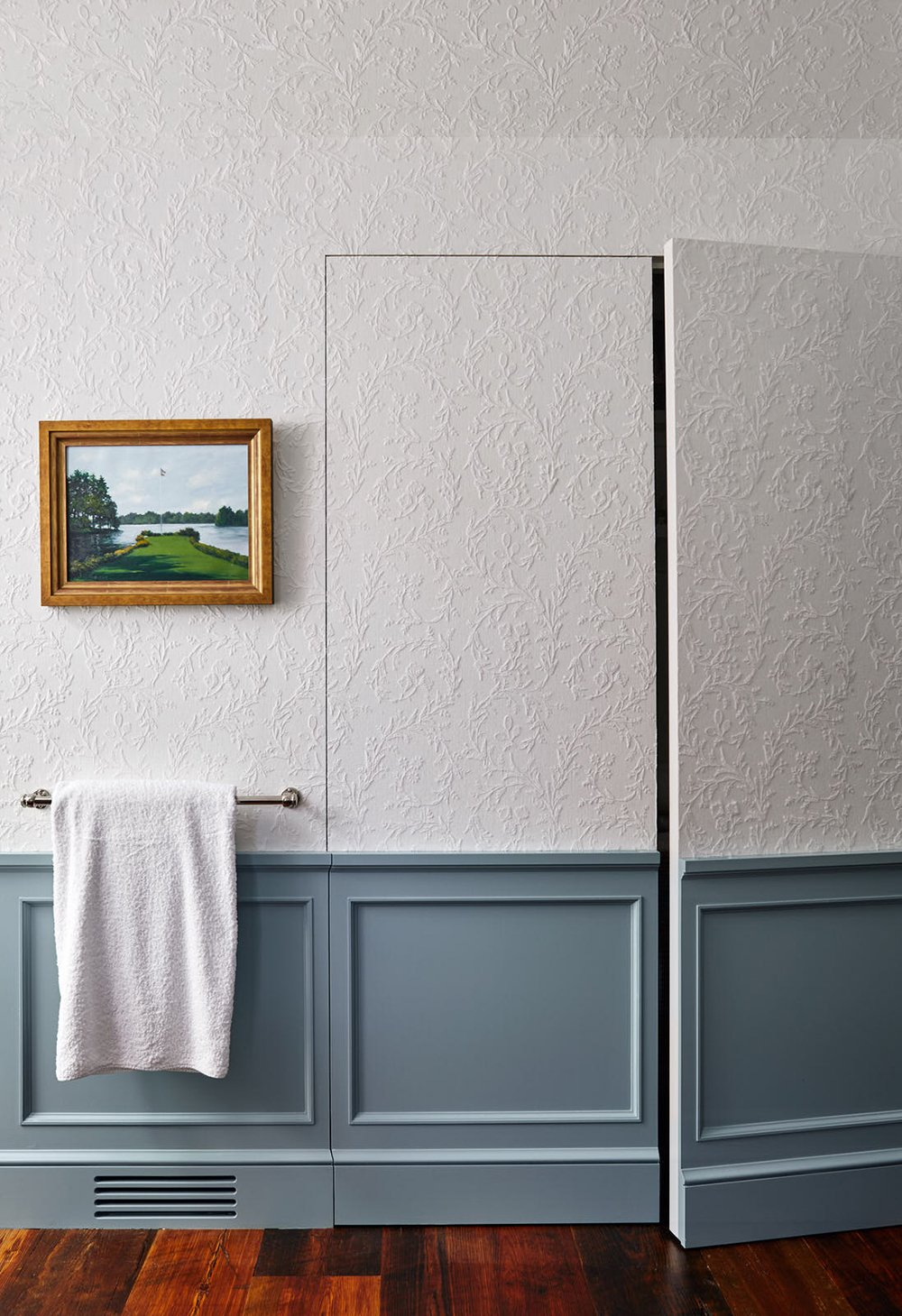
Below, the storage doors feel very modern to me in the way they were cut out, but I’m thinking this was an intentional decision to continue the historic look, without adding heavy doors or additional millwork to detract from the overall look. It really makes the room feel larger without taking away from the historic elements. I’m also borrowing that integrated vent inspiration for my office built-in! I’ve been testing samples for our baseboard this past week.

Design Eye Training : 106 - roomfortuesday.com
design : lilse mckenna

Despite the neutral white color, the patterned and embossed textural wallpaper really pushes this space over the top and adds interest- without feeling overwhelming. It really softens the space in a timeless way and emphasizes the historic architecture. The antique chest turned vanity is another genius move on Lilse’s part to create a room that is historically appropriate and transports you to 18th century design. The warm wood matches the flooring exactly, creating cohesion and warmth on that side of the room. I also spent a good amount of time zooming in to look at the objects sitting on the countertop (hello silver vanity set). It’s beautifully styled and the addition of lime towels and greenery was another unexpected design surprise that seemingly works well. It’s not a combination I would ever try, but seeing it here inspires me to pair more unexpected colors.

Design Eye Training : 106 - roomfortuesday.com
design : lilse mckenna

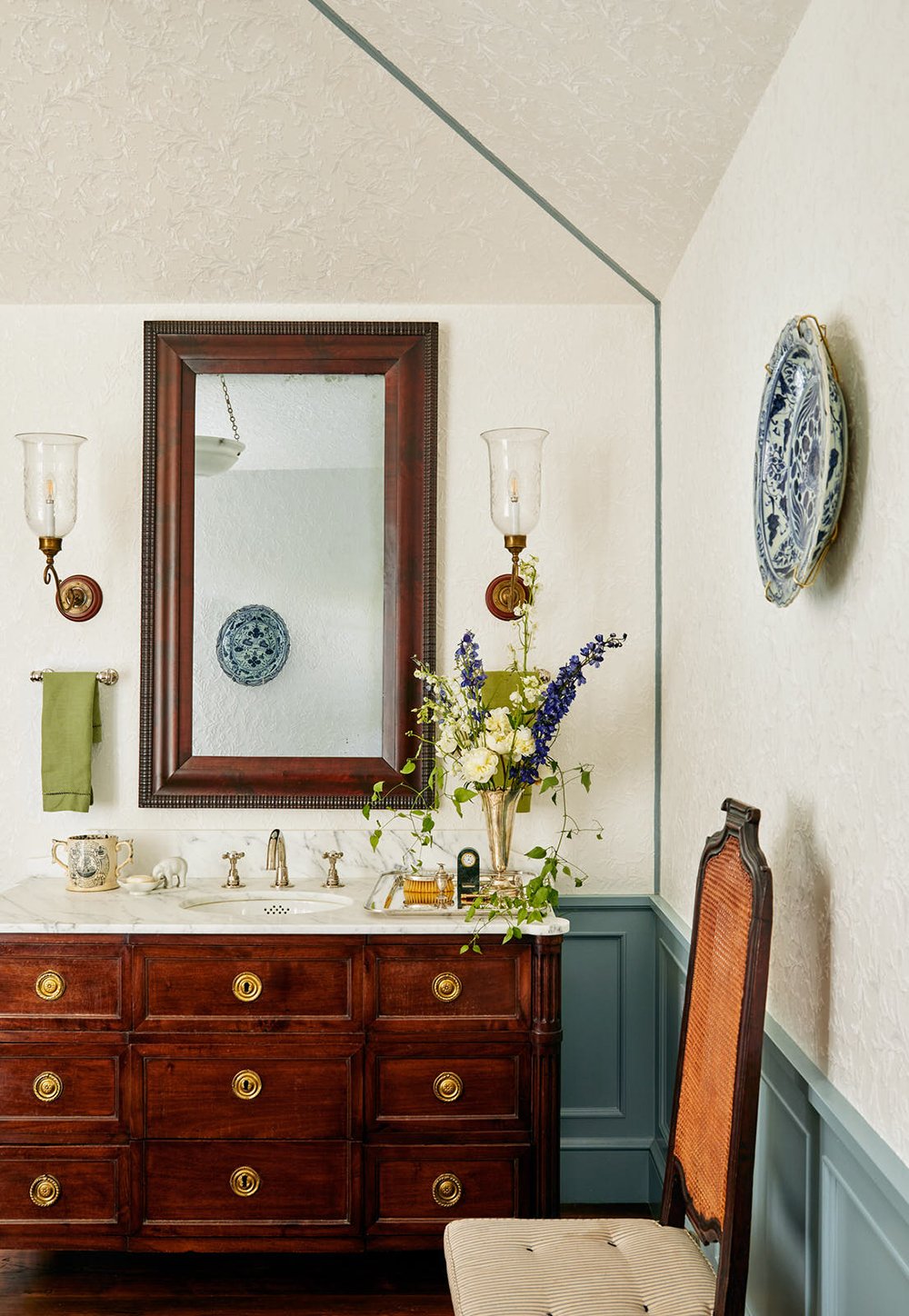
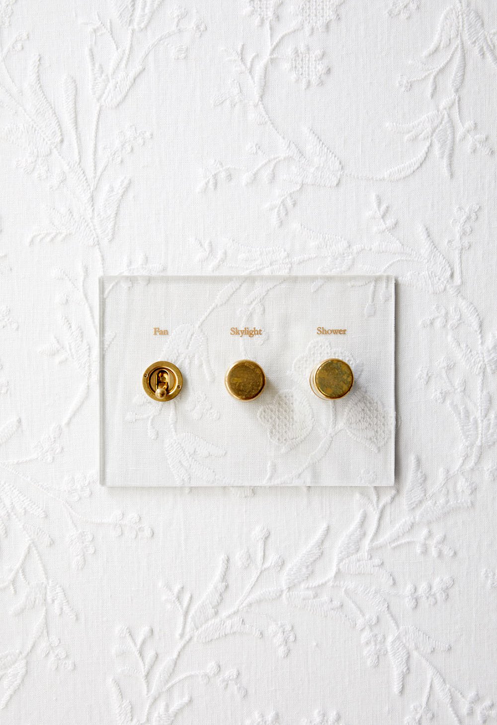
I also observed the blue & white porcelain serving bowls or plates used as wall decor (another trend I’ve seen gaining popularity lately). The round shape is a nice repeated element that mirrors the vanity hardware and adds a punch of historic color to the embossed wall treatment. The antique cane chair is another intentional piece that adds warmth, texture, and history to the space. In addition to all of the antiques, you’ll also notice plenty of modern amenities… like the beautiful light switch controls. This is a perfect example of pairing modern with traditional in a way that is functional and beautiful. Who would’ve guessed that a piece of acrylic or lucite would fit seamlessly into an 18th century bath? It’s wonderful!

Design Eye Training : 106 - roomfortuesday.com
design : lilse mckenna

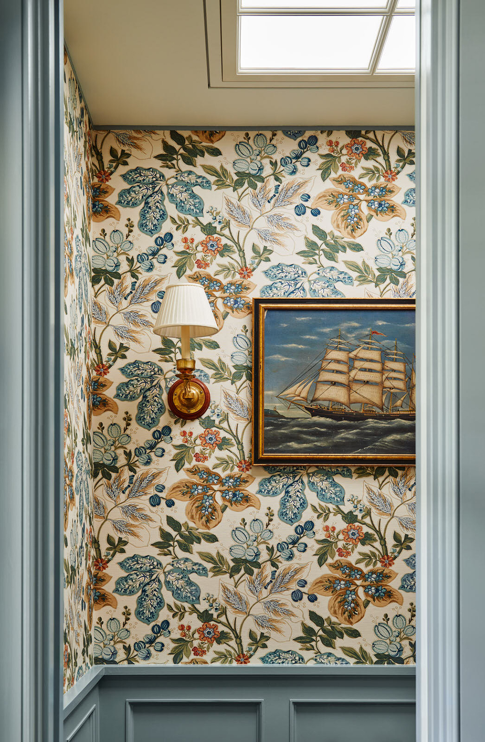
In the powder room, you’ll notice more wallpaper, but this time- vibrant, colorful, and the floral pattern is very bold. It’s a fun way to define spaces, create a designerly look, and implement color. I also enjoyed seeing the painted ceiling with the traditional skylight. If I were ever to have a skylight, I’d want it to look like this. Did you notice the vintage nautical art scattered throughout? How about the pleated sconce shades? There are so many thoughtful details that really make this bathroom feel special.

Design Eye Training : 106 - roomfortuesday.com
design : lilse mckenna

The paint color feels very reminiscent of my guest bedroom (Sherwin-Williams Halcyon Green)… perhaps that’s why I’m so attracted to it? I was able to find many of the sources as seen in this bathroom, which I’ll drop into a slider below. Most of them are vintage or antique, and some are quite costly- but there are also some budget finds in there as well. Another Design Eye post is in the books… did you enjoy this one? I can’t wait to hear the things you noticed and admired in this historic bathroom! Did you find any inspiration that can translate to your own home? Here’s to a fantastic week ahead.

Leave a Reply

Your email address will not be published. Required fields are marked *

11 Comments

  1. Hi Sarah! What a fun space to admire. I’m a little obsessed with the hidden doors. They’re actually called “jib doors” and were used during the Georgian era to hide service entrances, etc. So, they’re perfectly in keeping with the period of the house (although I haven’t seen a double-door installation before – so fun!). I love the idea of using one to conceal a coat closet in an entryway with a beautiful wall paper or traditional mural. Happy Monday to you!

    1. Isn’t it beautiful? She did an amazing job. Yes- I knew they were called jib doors, but I didn’t realize their origin for service entrances during the Georgian era… so thank you for the history and design lesson, Julie! That’s awesome, and I learned something new today :) They’re definitely well suited for this historic home. I’m with you on seeing these in entry spaces or behind a traditional mural. I can only dream of that! Hope you’re having a great week. xo

  2. Putting us right to work on a Monday morning! OK. So much to admire in this space! The rich colors definitely jumped out at me. The green-blue contrasting the orange tones in the floor, tub and caning are favorites. I also noted all of the subtly shimmery metallics. The warm patinaed brass and golds are really appealing. Love the touch of wood on the sconces, and I’m wholeheartedly in favor of the vintage nautical paintings. The textural wallpaper though…I’m conflicted. At first I thought the image quality was strange. Then I figured it was anaglypta, which might be historically appropriate (not an expert :-). But in the light switch close up, it actually looks like embroidered fabric, which could be a clever needlepoint reference! All that to say, I feel like it’s a detail that might translate better in person. I found it distracting. Although I adore the moulding style, my eye also kept being drawn to the thin line that appears to highlight the corners and a ceiling angle? Another detractor for me; it reminds me of conduit. I do like the introduction of the cool modern glass shower door and switch plate. The gleamy marble shower looks so inviting! (And, what do we think lives behind those awesome jib doors??) While those heart pine floors are the dreamiest, I would love to see a vintage rug or two for stepping out of the shower and bath. I’m completely smitten by the sink vignette! The antique chest and those lime towels-a whole lot of yes. The silver tray, the floral arrangement, the green marble clock, the elephant soap dish! So charming! The shot of the powder room warms my color and pattern-loving heart. Speaking of the powder room, an aspect of this design that I am noting is the layout. I appreciate that she devotes the main space to the stunning tub and chest, then provides access to the necessaries with symmetrical views behind. I don’t know that I’ll ever have a chance to design such a bathroom, but this floor plan would definitely be a contender. So many delightful details. Thanks for an awesome class this morning…and another talented designer to follow! I’m anxious to hear what everyone else has to say. Cheers to a wonderful week!💜

    1. I hit the ground running yesterday, ha! I really enjoyed the color palette in this space. I also admired all of the mixed metallics and luxe finishes. Mixing copper and brass is TOUGH, and she did it so well. The wallpaper isn’t for everyone. I don’t think I’d ever install it in my home, but I do love the way it looks here, and I also noted the lace / needlepoint effect… very cool! It might be one of those details to see in person. The size of the painted millwork up the angular part of the ceiling also reminded me of conduit. I probably would’ve painted that white to blend, but am guessing it was probably to keep all the trim consistent. The shower door and switch plates both felt like an awesome modern contrast to me! I echo your sentiments on the vintage rug- I could definitely imagine one or two in this space… or at least a textural bath mat. I really liked the styling- especially on the vanity. Great point on the floor plan- it’s definitely balanced and beautiful. Thanks for the fun insight and design chat! I hope you’re having a good week and you have an awesome time with your bestie! xo

  3. Good morning! Right away I noticed the ribbon of contrast trim color going across the ceiling; you can spy a great view in the first picture. That same ribbon is repeated in the water closet around the skylight. While slightly unconventional, it’s a stroke of genius. The optical illusion it creates gives the sense of a higher ceiling, making the room feel more modern and spacious.
    The mix of metals and wood finishes in this bathroom is stupendous! I’m loving the deep, rich tones against the copper tub, and the scattered pieces of darker furniture (the stool and cane back chair) offer a beautiful contrast element for the eye, and keeps the space from feeling monochromatic.
    I couldn’t help but notice the complimentary pieces she included in the space. The caneback on the chair is the same rich warm tone as the copper tub; the artwork next to the shower features stormy coastal skies that perfectly emulate the interior of the shower in its surroundings; and the same goes for the artwork in the water closet. The vanity in the same tone as the floor, and even the two wallpaper choices compliment each other in subject. One offers that lovely textural layer we always talk about, while the other layers the colors perfectly against the contrast trim. These pieces are so intentional that even changing their locations within the room would exude an entirely different vibe and vignette, because they look like they were made for the space, and the way it all works together offers that comforting, cohesive look that I find inviting.
    My favorite touch has to be the light switches-I’ve seen those acrylic switch plates in my internet travels, and I find them far more beautiful than their typical, more common counterparts. Items such as these prove that sometimes you can have beauty and function.
    On to the styling. The floral arrangement on the vanity takes the cake in styling pieces that do work! It is not lost on me that the shades of green mirror the linen choice, or that the beautiful blue flowers are the perfect shade to compliment the blue and white porcelain pieces on the walls. The sconces for the vanity create a show stopping scene with all of the styling elements. For my taste, I consider this a heavily styled vanity, but the way everything works together so fluidly, it doesn’t feel overdone, and no piece detracts from another.
    I think you’ve given yet another example of a space that, looking at the individual elements, I’d likely not choose most for my own space. However seeing them in conjunction to each other, I’d say yes please! Who wouldn’t want this bathroom? And who on the face of the planet wouldn’t want to see the rest of such a timeless home?! Wonderful choice for design eye training Sarah! I hope your week is off to a great start! Are you experiencing the heat wave too? We quickly went from a cool 70/75 to 100. I’ll be in the pool most of the day, ha! Have a good one. Xo

    1. I definitely agree, Lauren! I love the repeated millwork throughout. I also enjoyed seeing warmer, rich wood tones. I feel like lighter, cool hued wood is having a major moment and is more prevalent, but the warmer palettes really speak to me. It’s beautiful! All of your points are spot on. Aren’t those light switches amazing?! I tried to find those online, but didn’t have any luck. I wonder if they’re custom. Beauty and function for the win! The floral arrangement is really gorgeous- I admired that too, alongside the green towels. The entire house is really cool! Did you click through for the complete tour? The kitchen is equally as beautiful! I love seeing designers restore or renovate homes to their former historic glory, intentionally considering the period for the design plan. A job well done! We are most certainly in the heat wave with you. Whew! Excessive heat warnings here all week- and yesterday the high was 104. Oof! I’m wishing we had a pool right about now. I hope you enjoy the pool time! Have a drink for me ;) xo

  4. Julie Marquez says:

    I love this series because it actually causes me to slow my scroll and spend time looking at a picture. With how fast I normal get through things, it’s nice to have a conversation about the details and really spend some time with the picture.

    I am wondering about the colored line from the corner on to the ceiling – what is that? The millwork is beautiful and I love the detail of it all. The wallpaper just reminds me of a heavily textured florida house, something that looks off to me. But I love the pattern of the wallpaper in the bathroom, the scale is not too large and not too small.

    1. I totally agree, Julie! Slowing down and really taking the time to analyze what I like about a space is the most fun. I’ve been trying to do more of that in general- slow down, appreciate little moments, and reframe from rushing through everything. Thanks for the reminder that it’s always a good idea to take it slow. The colored line just looks like a piece of millwork to me- maybe a piece of cove moulding or quarter round to make the seam look more refined? It is interesting that it was painted the aqua color match the trim, instead of white- which would blend with the wallpaper. It definitely draws your eye upward because of the high contrast. I also love the wallpaper in the bathroom- such a beautiful floral! Hope you’re having a good week so far :)

  5. Wow, what a perfect space to choose for this design training session, Sarah! I’m woefully late, but couldn’t resist commenting on this one. Having grown up in Northern Virginia, I’m very familiar with the Maryland coast and their historic homes, and can attest that this design fits absolutely perfectly there! From the color scheme to the antique fixtures to the little touches of modern; all feel right at home here.
    I, like you, was surprised to find myself liking the unexpected lime green towels with the more colonial trending blue/green paint color. More things I like: the textural, but subtle wall paper, the timeless shower tile, the built in baseboard vent, the light switch controls, the skylight (have not seen skylights done like that before), the warm pine flooring and, of course, the amazing copper tub. Speaking of the tub, though, I’m wondering how that works being on top of those beautiful wood flooring?! They must be super careful with splashes and not have any young children they’re needing to bathe in there, especially given that I don’t see any rugs next to it.
    As for things I’m not as big a fan of: the porcelain bowls & plates (I know they’re a common theme right now in many room designs, but I just don’t like the look of them, not to mention the breakage factor, in a bathroom), the thin, colored millwork going up the ceiling (cheapens the overall look and feel of a beautiful, high end space to me) and the “hidden” storage doors. I know they fit period wise, but I’d have much rather seen an antique cupboard or curio cabinet there and they could have (I would think) recessed it into the wall to save space, as well as make it look like it was always there. I think I’d like hidden doors more in a space where it really makes sense and isn’t as “clear cut”, like on top of a wall mural where the cut lines would blend in more seamlessly. Lastly, the “watery” artwork. I would love to have seen a little more “modern” brought it that way with some beautiful line drawn nudes or more abstract works. The nautical artwork feels a little too theme-y to to me.
    Anyway, just my opinions and overall, I really love the space and what Lilse did with it, primarily keeping the design more period specific to the home. In addition to her choices, I would imagine the homeowner may have had some ideas/preferences for the space, as well.
    Thanks, Sarah! I really enjoy learning from you and everyone who comments, who point out things I hadn’t noticed. Had no idea that type of door is called a jib, for example!

    1. Hi Anne! That region is so gorgeous! I’m envious of all those stunning historic homes. The lime green towels were definitely a surprise! That skylight is really beautiful and impressive. I don’t think I’ve ever seen a traditional style skylight like that, but it’s cool. I’m with you on the plates on the wall trend… I don’t mind it, and I think it works in lots of scenarios, but it’s not a style or look I’d ever install in my own home. Something about that makes me nervous or feel uneasy- definitely relating to the breaking factor. I loved reading all of your points! Thanks for chiming in :) Hope you’re having an awesome summer! xo

  6. Susan Sjoberg says:

    What is the name and source of the colorful bathroom wallpaper?