Design Eye Training : 113

Design Eye Training : 113 - roomfortuesday.com
design : sarah bartholomew

How was your weekend? Our family is still here visiting and we’ve been having the best time sharing our favorite places with them. Today, I’ve got a new Design Eye Training post lined up for you.. our first one of the year! We’ll be analyzing and admiring a gorgeous room from the Kips Bay Decorator Show House, designed by the talented Sarah Bartholomew. This space is a workspace- or studio office of sorts. Though it has a neutral color palette, it’s anything but boring and is packed with fun design surprises to discover. Have I piqued your interest? Click through to talk design with me!

To quickly recap… in our Design Eye series, we observe and admire design fundamentals like scale, texture, pattern, material use, lighting plans, color, floor plan & layout, and a variety of intentional styling & interior moments pulled together by the pros. It’s an exercise I used to practice often in design school, and one I still enjoy today. By discussing and breaking down well designed spaces in greater detail, you’ll begin to train your “design eye”, build upon the design fundamentals, and can apply some of these things to your own home, if they appeal to you. I also feel like this series can really help you hone in your personal aesthetic, determining what you like and dislike… and most importantly, why. Ready to give it a try?

Design Eye Training : 113 - roomfortuesday.com
design : sarah bartholomew

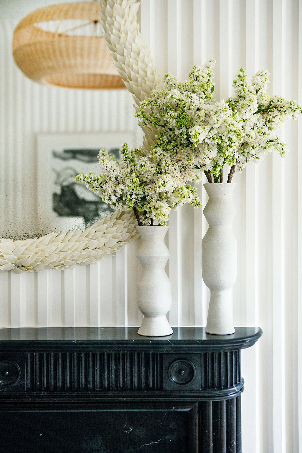
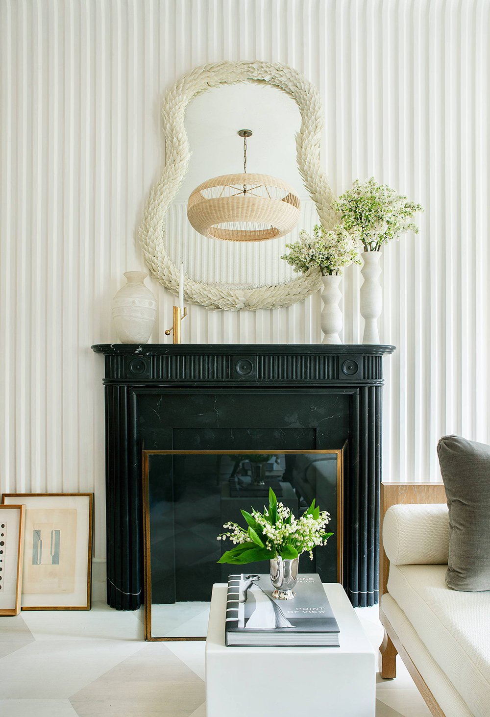
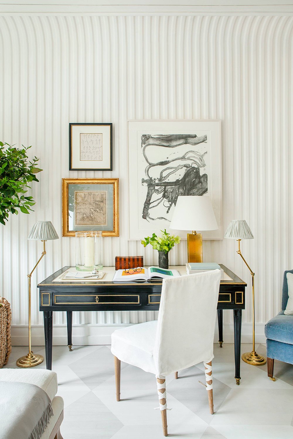
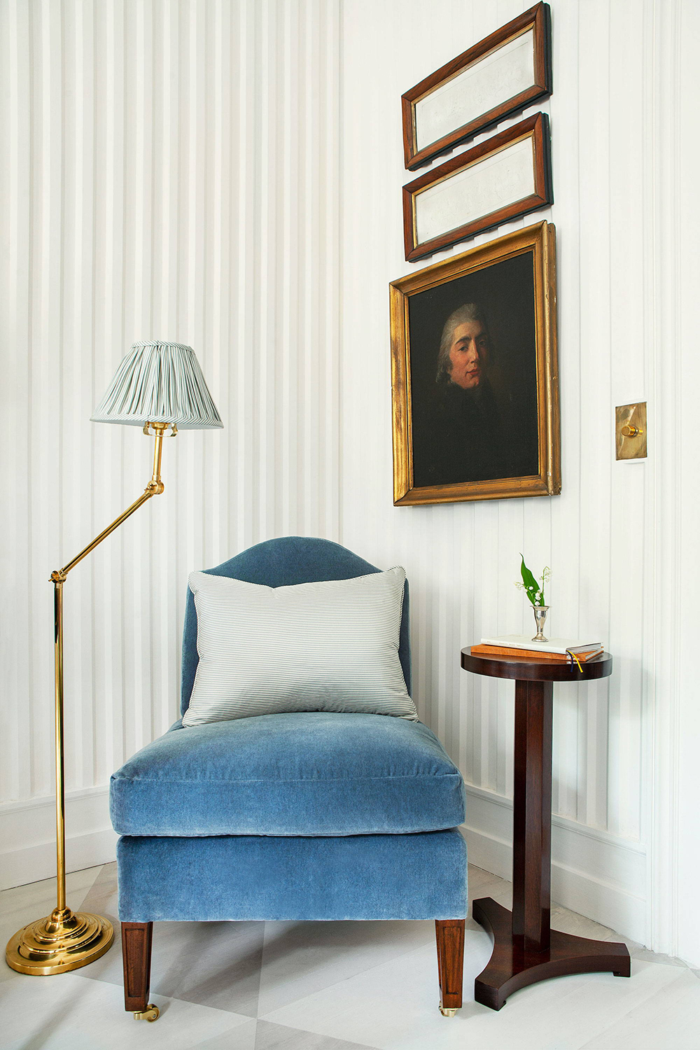
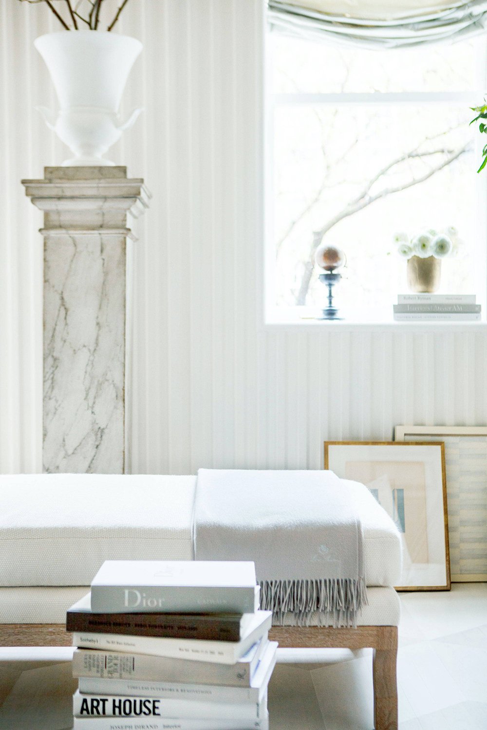
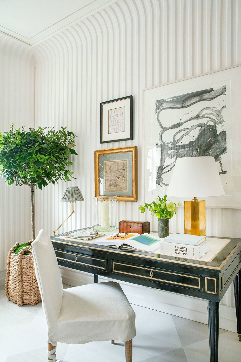
This first word that came to mind when I scrolled this space was dimension. From the striped wallpaper to the fluted fireplace, there are plenty of vertical lines throughout this space that draw your eye upward to the curved ceiling architecture, creating depth and a ribbed effect. It’s a reoccurring theme in this room. In addition to line, there are plenty of other sharp geometric forms to be found… take note of the floor pattern, abstract art, and gilded lines within the writing desk- so many shapes with hard edges!

Design Eye Training : 113 - roomfortuesday.com
design : sarah bartholomew

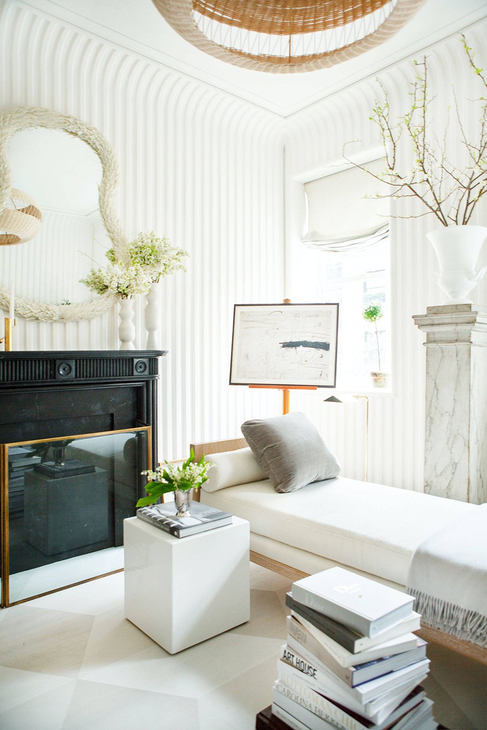
To soften those hard edges, luxe textures create a beautiful balance. From the upholstered daybed with the velvet cushion to the throw blankets, ruched roman shade, wispy florals, and mohair slipper chair, this room feels chic and inviting.

Design Eye Training : 113 - roomfortuesday.com
design : sarah bartholomew

Oddly enough, I was able to compare quite a few key points from this space to my own home office… the black desk, the gallery wall behind it, a daybed, statement lighting, white plaster finishes, and a traditional upholstered white desk chair. No wonder I’m attracted to this studio space! It has a familiarity to it.

Design Eye Training : 113 - roomfortuesday.com
design : sarah bartholomew

I also really appreciate the lighting in this room. Despite the abundance of natural light, I imagine it’s very cozy during the evening hours. I counted five lamps in this space, in addition to the overhead pendant. I’m into the layered lighting look, and the pleated shades are a nice traditional touch paired with the modern forms throughout this home office.

Design Eye Training : 113 - roomfortuesday.com
design : sarah bartholomew

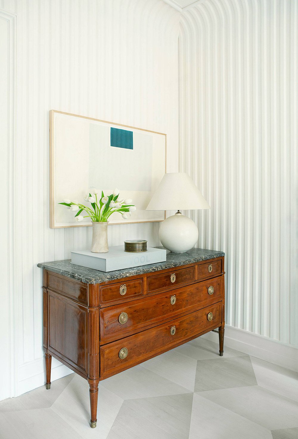
Speaking of, there is a great mix of old and new here… antique pieces mixed with new upholstery and fresh styling. It also has a casual feel to it, which I think the styling suggests. Leaned artwork, stacks of books on the floor, and a desktop that feels like it’s actually in use keep this office space looking approachable.

Design Eye Training : 113 - roomfortuesday.com
design : sarah bartholomew

There is a LOT of curated artwork throughout this room. Plenty of modern abstract pieces and even a traditional portrait. They’re all framed very nicely and I especially like that a work is displayed upright on an easel! I just inherited an antique easel from my step dad’s grandparents and I can’t wait to find a place to style it. Artwork can be installed anywhere- not just on the wall.

Design Eye Training : 113 - roomfortuesday.com
design : sarah bartholomew

I’d love to hear what you liked about this space? Did anything specific jump out to you? I found the dimension, textural elements, artwork, and custom upholstery especially beautiful… and the gorgeous nero marble fireplace! Be sure to follow Sarah on Instagram for more timeless design inspiration. She’s wonderful and so talented! Here’s to a wonderful week ahead. I hope you have a good one!

Leave a Reply

Your email address will not be published. Required fields are marked *

10 Comments

  1. Good morning, good morning! I have never loved a white room more! The word that came to my mind was texture for the attributes you labeled dimension. (Your word is better.😃) In just the first image, I noted the ribbed wall treatment, that fluted fireplace😍, the dragon-scale mirror, woven pendant and the fluffy white florals. (Speaking of florals, I count five different lovely white florals, yet it doesn’t feel obnoxious.) I also spied the abundant geometry: the cube table echoing the fireplace screen, the amazing floor pattern, the boxy marble-topped chest, the table lamps- a sphere and a rectangle. As for lamps, a beautiful and varied collection! The most striking assemblage, though, has to be the art! From modern abstracts to judgy ancestors. Leaning, hung singly and in groups and propped on an easel. I am here for these vibes! Although fun, I sometimes find the show house rooms distractingly over the top (even for me!), but this feels like a real room…albeit for someone whose life is more sophisticated and glamorous than mine. Thanks, as always, for a thoughtful and gorgeous Monday! Cheers to continued family adventures! (I was a bit envious of your ice skating!)💜

    1. Hi Peggi! I’m glad you liked this one, despite the neutral color palette! SO much texture to admire here… you’re definitely right. How did I miss the dragon scale on the mirror?! That’s so beautiful and interesting. Show rooms can definitely be over the top or not as practical, but I enjoyed this one. Perhaps it’s different in person, but the photos read pretty practical. We had the best time with our family and were sad to send them back to Nashville. Until next time! Hope you’re having a great week! xo

  2. Happy Monday! So glad you had a wonderful weekend with your family Sarah. I bet your niece and nephew are having a blast with their super cool Aunt Sarah ☺️ Yay!
    Wow, this office is definitely chic and so much to admire in this space. While I love all the glorious details you’ve pointed out, I’m loving those harlequin style flooring. Is it hardwood painted? Or maybe it’s some sort of linoleum? I would love floors like that at the cottage. Anyway this office is stunning, there are so many different layerings of materials and textures that blend so seamlessly together. It’s a really interesting space indeed. While it’s lovely, it honestly doesn’t have the coziness of your office or feeling of comfort. It might be a bit too white for me, I’m not sure. I really do love so many details and the feminine softness which translates to a very delicate vibe I think. Actually I would probably make a big mess here! It might be a bit too precious for me. Haha! It is so very pretty though. She’s a very talented designer indeed. We’ll continue to enjoy your family’s visit Sarah! Cheers to a fabulous week 🥂😜👍

    1. Hi Colleen! We had the best time with the kids- we were sad to see them go back home to Nashville. Isn’t the flooring in this space amazing? I think it’s hardwoods that have either been painted or stained. I bet that would apply nicely in your cottage. You’re sweet for mentioning my office- I feel so lucky that I get to work in that space everyday. I really love it! Hope you’re having a good week. xo

  3. I looked long and hard at this because it is so visually appealing. The floors caught my eye. I first thought tile then upon further pictures realized they are a wood product that has been stained. Beautiful! The wall paper is a great idea to look like wood slats without the cost. I was fooled on that too at first. I am with Peggi, I noticed the different white flowers and how gorgeous they were without being obnoxious or too much. Makes me want to have some in our house after all this cold weather. I love the traditional pieces as well as the modern. Maybe that’s what it is…both modern and traditional without being all one or the other. Give me all the brass lamps, hardware. I need a pedestal in our home too. Good ‘design eye training’ today Sarah!
    Hope your weekend has been fun with family. Ours was busy but loved meeting all the moms in our son’s fraternity. Such good young men! We have sun today and I need to get out and enjoy it even with the wind. xoxo

    1. I also loved the floor, Danna! I’m with you- I think it’s wood that has either been painted or stained. I went to Trader Joe’s before our family arrived and stocked up on some flowers… white hyacinths, tulips, and hydrangeas. Now I’m thinking I need to grab some more to replace them during my grocery run this week. They have been making me so happy! I definitely love the mixing of modern & traditional when it comes to interiors- such a classic juxtaposition. I’m so glad to hear you had fun with the other parents at your son’s frat weekend! That sounds incredible and I’m sure you all made some wonderful memories. Hope you’re having a good week! xo

  4. Super chic pick, Sarah, but I have to to say, I’m with Colleen on this one. It’s a bit too curated for me, like I find most show houses to be, but I do love some of the individual features and design choices you pointed out — especially the artwork on an easel, the gorgeous black desk and overall just how layered everything feels from the textiles to the lighting. I couldn’t imagine myself working here, especially with the desk facing the wall, but I do appreciate the beauty of the design. I’d take your office any day, though! Have fun w/ the fam!!

    1. Definitely, Anne! I could totally see that. The artwork was a highlight for me, too! I do love my home office- I feel totally spoiled working in there everyday. We had a wonderful time showing the fam around. I hope you had a wonderful weekend as well! xo

  5. Good morning! We have no school today so Im catching up on everything I’ve missed. And Im just going to put this out there- Im here for the wallpaper! I had to look very intently to be convinced that it wasn’t a slatted wall treatment- and then I had to visit her website and enlarge the images. Mind officially blown! What an amazing trick of the eye; and I love that she carried it partially onto the ceiling to give added depth and dimension- whomever handled those corners needs a raise, ha! What works here for me is all the softness of the curves paired with the super geometric. The urns and vases, the bolster pillows on the daybed, the overhead lighting, bases of the floor lamps, the side table…all are a very structured and poignant against the geometry of the room- right down to the relaxed Roman shades and mirror. I’m a huge fan of the floor- what a lovely treatment to apply in a space like this. However it was accomplished it’s beautiful. Of course the artwork here is impeccable and who wouldn’t want such bespoke pieces gracing their workspace? But for me, what is more striking is the organic, unstructured nature of the floral arrangements. I’ll agree that it’s a lot of white, a room I’d never want to touch, but gosh it’s so well done! Thanks for sharing this one Sarah!

    1. I hope the kids had a fun no school day! I’m also in catch up mode over here today… and I’m here for the wallpaper! Ha. Best statement because I’m always here for wallpaper. What a cool geometric treatment that is pretty convincing of slats, indeed. The designer definitely got the juxtaposition right with so many hard edges paired with softer feminine curves- a beautiful balance! I love all of your observations and the floor was also one of my highlights. Such a pretty space! I’m glad you liked it, too! xo