Predicted Paint Colors for 2018
 This post was SUCH a hit last year, I thought it’d be fun to do it again for 2018. I really love using color throughout my home and feel super comfortable making paint selections. I’ve said it once and I’ll say it again- if there’s one design element I feel confident in- it’s color theory. I truly enjoy working with colors, mixing, and finding palettes that play well together. Click through to see what I’m predicting will be popular in 2018!
This post is not sponsored by Sherwin-Williams, but they have become our paint preference over the past year. I have all of the swatch books, and Emmett prefers their quality to other brands…. so the following are all SW paints. We do have a few Benjamin Moore colors in our house as well, but we typically just have our local Sherwin-Williams color match.
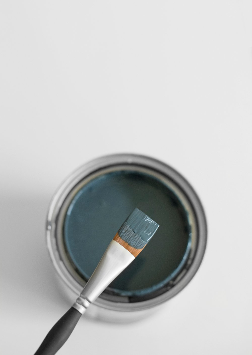
Alright, let’s dive in shall we? The right paint color can make or a break a space,
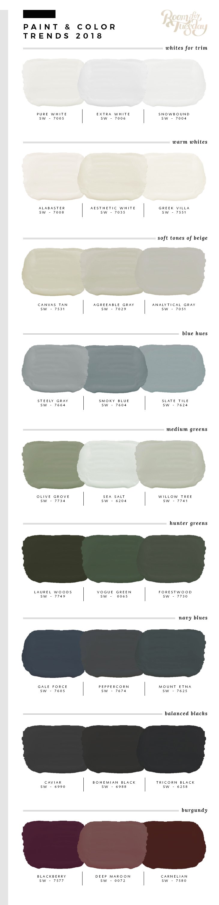 As far as trends go, this year I’m expecting we’ll see more color. Gone are the days of white and gray. In 2018, I’m all about bold hues that make a statement. You’ll notice more saturated colors and deeper hues coming into play. I think it’s going to be a big year for blues, burgundy, and warmer beige tones.
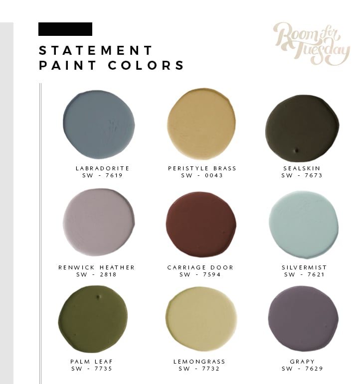
Other wild card colors to be on the lookout for? If you’re not afraid of color… I’m seriously loving these tones- expect a few to pop up in my own home later this year:
 Sometimes a color will get too trendy, too fast, and suddenly everything looks the same (which I’m not a fan of). If I’m attracted to a popular color, my goal is to use it in a new way (ahem, I’m looking at you green), or experiment with a different tone or hue that feels less ordinary. For instance… rather than sticking with the same hunter green, try pushing it towards a muddy pastel, desaturating it, or mixing a little black to deepen the tone. These will be better options when it comes to longevity.
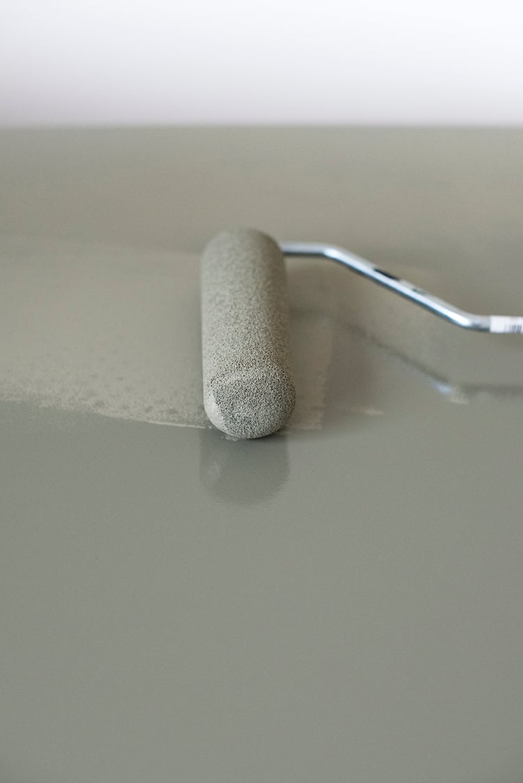
Paint is really a game changer. You can dramatically change the look of a room, piece of furniture, or even the exterior of a home with a single coat of paint. In my opinion, it’s the most underrated part of a project- and it’s relatively inexpensive. Here’s what you can find in my house when it comes to color:
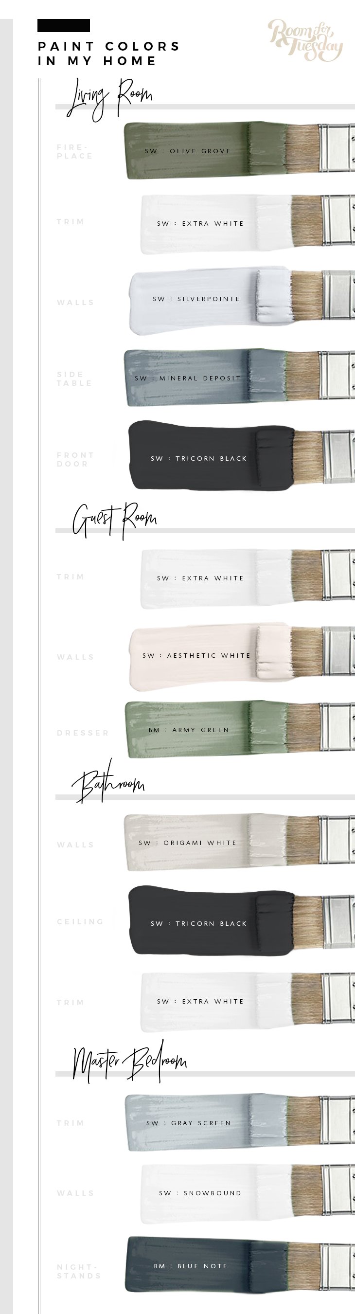 To see the above paint in action, feel free to visit the following room reveals: LIVING ROOM // GUEST ROOM // BATHROOM // MASTER BEDROOM
It’s kind of funny to see all of the paint used throughout my entire home in a collage like this. It turns out, I definitely have a palette. I don’t think homes should be super matchy matchy, but I do think consistency within the palette is a good thing. You never want one room to feel like it doesn’t belong under the same roof.
 Lastly, I’m also bringing back my tried and true painting tips:
- Stop using painters tape. I HATE painters tape… it never works and leaves a squiggly, uneven line. I’m always much happier when I free-hand with a nice brush. If you’re not sure how to do this… watch this video.
- Stop painting first. People always ask how I compile a color palette for each room. It seems that everyone has trouble selecting paint colors because it feels sort of permanent and daunting. It’s actually really easy! Painting is always the last thing I do to a space (besides styling). I pull swatches from the textiles, furniture, or art. It’s always a great jumping off point when it comes to inspiration. Just because you’re moving in or a room is empty, doesn’t mean that painting needs to happen immediately. Live in the space for awhile, see how the light interacts, find a couple objects that work well in the space and go from there.
- Buy quality paint and supplies. This seems obvious, but until I started using nice paint, it used to take forever. I value my time and the way a project turns out. You can get by with only 1-2 coats if you buy the appropriate paint. There’s literally a paint for everything. Technology has come a long way… from self-leveling paints to organic and green paints, they’re safer and easier to use. Ask a professional which one is best for your project.
- Always order a sample. Don’t be the person who spends a ton of money on paint by looking at the tiniest swatch, only to paint your wall and hate the color. Taking the extra time to order a larger swatch or tiny jar of paint is well worth it and makes it SO much easier to decide if the color is what you expected.
- Know your finishes. It’s a given that different finishes should be used in different areas of your home. Do a little research to see which finish is appropriate. Typically (most of the time) trim should be semi-gloss and walls should be flat, eggshell, or matte. The same goes for doors… semi or high-gloss is best and easiest to clean.
- Throw the rules out the window. Just because trim is typically lighter than your wall color, doesn’t mean you can’t switch it up. Take our bedroom for example, contrast trim wasn’t super popular at the time I painted, but I knew it would look amazing- so I went for it. Don’t be scared to go bold or trade things up… it’s just paint.
What do you guys think? Do you have any ideas as to what colors we’ll be seeing more of in 2018? Any painting hacks or tricks of the trade I should know about? I can say- I’m looking forward to seeing more color this year.